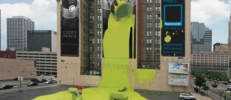
Nationwide Insurance Wallscape—Dripping with Creativity

Rarely in life do you have one of those moments where you are so awed by witnessing a thing, “Did they really do that? wow!” your jaw might as well do the figurative hitting the floor action. What am I talking about? An amazing “billboard” that Nationwide Insurance put up in Columbus, Ohio. This company does not follow the staid, unimaginative route when it comes to billboards, no sir. This is certainly one of the most eye-catching and adventuresome marketing efforts put forth by any company.
The billboard, or wallscape to be more exact, has three panels, attached to a wall on the Atlas building in Columbus where the headquarters of National Insurance is located. The ad is conspicuous for its overall bright yellow, the color of the paint dripping from the can. The marketing effort purports to sell Coop’s Paint, but the actual advertiser is Nationwide. (By the way, Coop’s Paints is a fictional company!)
The first panel of this innovative triptych says “Life in full color” under three cans of paint. In the second, paint is spilling out of the yellow can, down the ad, and seems to be spreading all over the side of the building and over parked vehicles below it, merging
the realm of the imagination with real life. The third tells viewers that “Life comes at you fast,” a tagline for Nationwide.
The creators assume people will get the connection, that disasters like spilled paint cost money and that getting insurance can help ameliorate the cost of fixing the problem. In short, smart people carry insurance because the unexpected has a way of coming at you out of left field.
Billboards with Pizzaz
Though creativity isn’t a word that most viewers would apply to a billboard, it’s a fact that each year a few stand out with their humor and inventiveness. This billboard certainly falls in that category. The willingness of the people in charge at Nationwide Insurance to take a chance certainly worked to their benefit.
Imaginative advertising like this gives extra attention to billboards, making them work even better. The more attention-grabbing the graphics and colors, the better chance they have to focus the attention of potential customers.
The Takeaway
One point to remember from this memorable billboard is it’s ok to expect viewers to think before getting the point. And the second is that outlandish is just fine if people remember your ad.
When hiring a creative team, choosing designs and investing in an ad campaign, remember the bottom line: if people remember your ad, you make sales, making what you pay worth every penny.