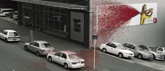
Kill Bill Wallscape

Bloody Effective Advertising
The pulp fiction movie “Kill Bill,” full of guts and gore, was advertised in New Zealand with a billboard that seemingly drenched passersby with blood.
Uma Thurman, the star of “Kill Bill,” was a Samurai with a sword named Hatorri Hanzo hoisted over her shoulder. From it spewed spatters of blood at a wide angle, drenching the far end of the billboard, the edge of the building, the sidewalk, cars parked on the street and the roadway itself.
Too Much Realism?
The creation by Saatchi & Saatchi NZ was judged an accurate promotion for the movie and a great attention-getter by people on the street and by moviegoers. But it also drew local criticism for being too realistic and simply too bloody for a public space.
You know when your billboard is generating buzz and attention that it’s working!
The billboard was put up at a busy intersection of Auckland, on the building owned by the television station that was screening the movie. This must have made it much easier to get permissions for the installation and bloody mess.
Saatchi & Saatchi NZ won a gold medal in the category of Outdoor Billboard Advertising Single for the billboard at the New Zealand AXIS Awards, which recognizes creative excellence in the country’s creative community.
Get Them Talking
Controversy can be a great thing for an advertiser. The “Kill Bill” promotion got just enough to be talked about, creating interest in the movie, but not enough for the billboard to be considered in bad taste.
Grabbing the attention of passersby gets tougher every year. You are dealing with drivers and pedestrians who are talking on cell phones, checking their tablets, and being bombarded with a slew of advertising on other boards, buildings and businesses.
Compelling graphics, like blood spatters, take a person aback, getting his attention for just enough seconds for him to register that the movie is set to run soon. And that’s all you have on the street, just seconds.
Shock Advertising
Though billboard creators will just about anything to snag a viewer’s attention, most shy away from shock advertising. This has been defined as a promotion that “deliberately startles and offends” and violates “norms for social values and personal ideals.”
Though shock ads often use blood, the “Kill Bill” billboard seemed to stop short of offending. It could be the smiling and beautiful face of Uma Thurman ameliorated the effect of all that blood.
Also, having the blood spatter off the billboard, and off the building, gave it a fantastical feel, unrealistic and flamboyant. This too reduced the shock value, setting it firmly in the sphere of entertainment.
It had all the elements of a success: Controversy – just enough of it. Creativity – check. Great location – yep, got that. Pulling many more moviegoers to the theaters – priceless.
BC Author – Ashwin Reddy
2015 © all rights reserved