Creativity Meets Simplicity

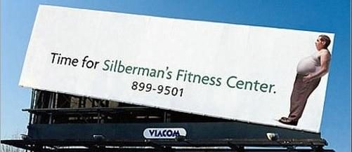
Dieting resonates among every age group from teen on up, every economic bracket, male and female. This Chattanooga, Tennessee billboard for Silberman’s Fitness Center sends a message loud and clear—time to get fit.
Easy to Understand
The minimalist presentation is easy to read by people passing by. The guy with the big paunch tilts the billboard to the right, reinforcing the straightforward message: Time for Silberman’s Fitness Center.
Billboards aren’t the place for lots of text, but this one has effectively reduced it to the bare minimum. It is expressive enough to bring uneasy laugh and heavy sigh from anyone dealing with tight clothes.
But overall, it delivers a message of hope, an essential for effective advertising: come to the fitness center and you will lose your gut. It’s funny and clever and clear. It grabs attention, even from motorists speeding by. The entire text is the call to action.
Billboards for Fitness Clubs
For a billboard to be highly targeted to a local audience, it should be put up close to the business it advertises. That automatically targets people who live and work in the area, serving as a constant reminder, 24 hours a day, 365 days year, or as long as it stays up.
This also makes it perfect for building brand awareness. If the message doesn’t get through, the logo imprints itself on the brain after motorists see it day after day for months.